October Recap- Designing Mobile Readers at Kobo
Posted: November 16th, 2010 | Author: Julie Rutherford | Filed under: Events | No Comments »uxWaterloo has lots of exciting events planned for November, including today’s Lessons from designing at Google event (which is at capacilty) and next Wednesday’s User Experience at RIM event (sign up if you haven’t already) . We hope to see you out for our November events and would like to share this recap of our informative October event!
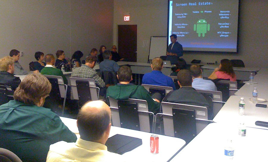
In October, James Wu spoke with a group of 40 uxWaterloo-ers about his work as a UI Architect at Kobo. In this role, James has had the opportunity to design products that run on iOS (iPhone, iPod Touch, iPad), Android smart phones, RIM products (BlackBerry smart phones & the new Playbook tablet), and their own well-regarded Kobo eReader.
With the shift from designing for desktop to mobile computing, James explained to us that we need to be aware of new constraints that will impact our design, graphics and develpment decisions.
When designing for smartphones and tablets, you cannot assume that all users will have standard hardware (e.g. CPU, memory, wifi, radio or screen technology). Users will be accessing your applications and websites from unpredictable surroundings, so you need to to design for offline cases. You also need to keep in mind that there is a high cost for bandwidth and a need to conserve battery life. James provided some examples of how a Kobo will only download e-books when a user is on wifi. Overall, it is important to use analytics software to understand what hardware is being used and this will help you decide what platforms and functionality to target and support.
When designing for smaller screens, we need to put more effort into prioritization and task analysis, so only the most important content is on the screen. There is less screen real estate due to smaller devices and on-screen keyboards, so James warned us to be aware of “hot spots.” A hot spot occurs when your buttons are so close together, that your application cannot determine which button was clicked by the user. Also, James and his team have designed affordances into their products, so new users know to click certain areas to view tutorials or instructions.
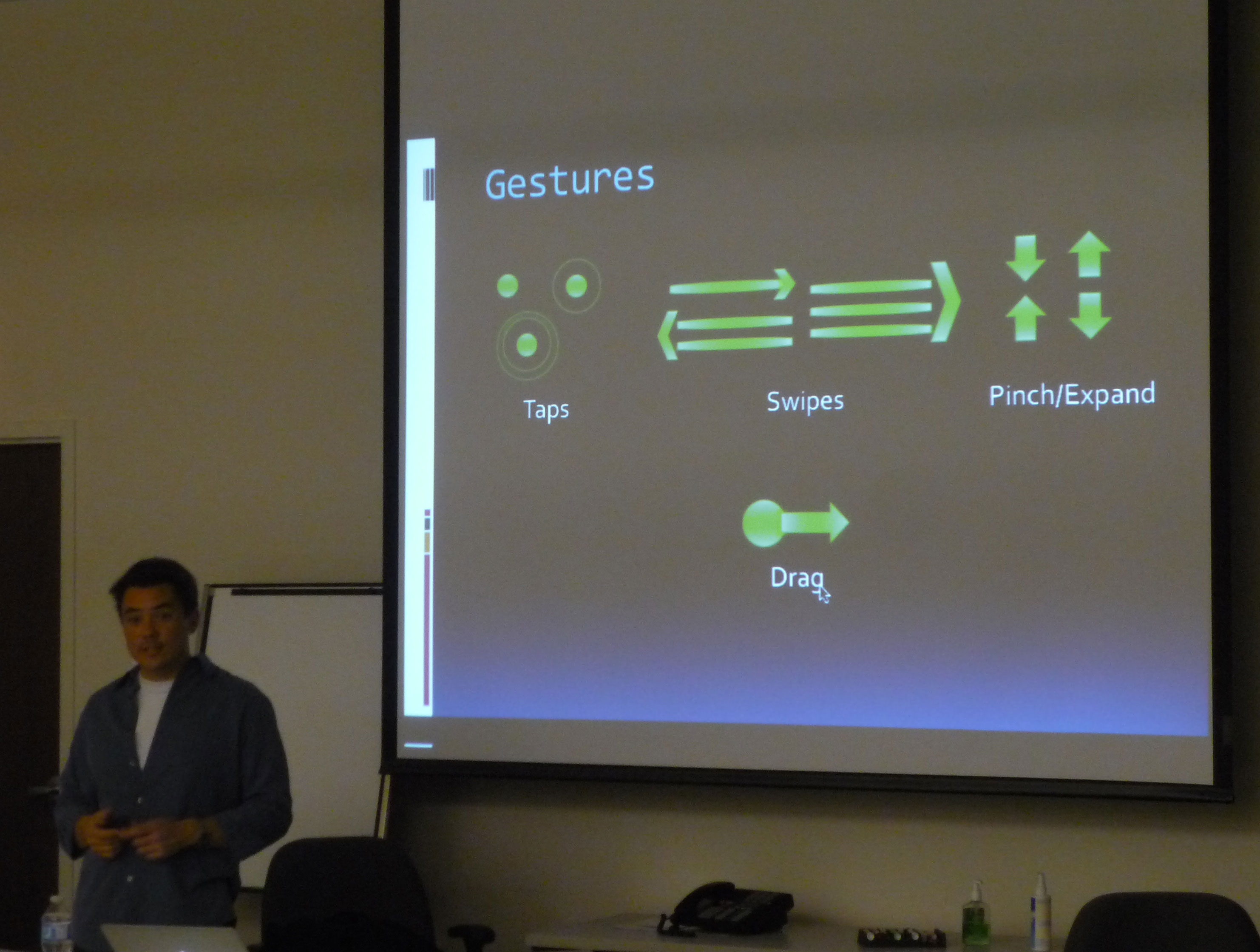
Touch screens on mobile devices give more options for gestures, such as tap, swipe, pinch, drag, shake rotate! Users can also control how they hold their devices, so you will need to anticipate how your design will function in landscape versus portrait view. You also cannot take a blanket approach to mobile design, as people use their tablets differently from their phones. To cope with these factors, James’ project teams have been able to use Agile project management techniques in order to better understand users’ gestures and behaviours. Agile will help you quickly understand what does and does not work early on in your project, by getting some early user feedback.
Many thanks to James for taking the time to speak with our group and for sharing his tricks and techniques!


Leave a Reply