Use your widget sidebars in the admin Design tab to change this little blurb here. Add the text widget to the Blurb Sidebar!
Posted: February 27th, 2011 | Author: Julie Rutherford | Filed under: Events | 2 Comments »
Last week, Sam Ladner, PhD, brought to our attention that even designers have unspoken theories about social life. These assumptions can impact how we think about the world, so we should become aware of our assumptions before starting any design research.
What assumptions do I have?
Do you find yourself thinking “how many people did we talk to in our usability tests,” “how many hits did our site get,” or “how can I add statistics to my reports?” This means that you have an implicit assumption that social phenomena can be counted and this leads you to focus on gathering quantitative information for your design research.
Maybe this doesn’t sound like you, and you think that counting and numbers are just not enough! You realize that people have different experiences, therefore you include more qualitative information into your design research. You want to see the world through the eyes of your respondents and aspire to have your participants’ voices heard.
Which design research method is best?
Knowing your implicit assumptions will help you understand whether you will gravitate towards qualitative or quantitative research methods. The best method is usually a mix of both qualitative and quantitative. However, you should also ensure that your design research method coincides with the type of project you’re on, your strengths, and your clients. You may find that you are in a situation where your clients have assumptions that everything can be counted, so you may need to be prepared to include some numerical data in your research.
Check out the Mobile Work Life Project!
Sam and her team are working on a sociological research study of work/life balance and mobile phones. Please let her know if you’d like to be a participant and follow the project on Twitter at @mobileworklife. Thank you, Sam, for taking the time to share your ideas with us!


Hope to see you at our March Events!
uxWaterloo has these two events lined up for March, and we hope to see you there!
Posted: February 23rd, 2011 | Author: Julie Rutherford | Filed under: Events | No Comments »
Our February uxWaterloo event Designers designing research: what methods do you choose? is coming up tomorrow and we hope to see you there!
If you missed our January event, Ali Ghassemi and Dariusz Grabka of Desire2Learn hosted over 50 uxWaterloo members and shared their insights about accessible design. They shared their key formula with us, which was:
Accessible Design = Personal knowledge x thoughtful design x good technical implementation +/- magic
Now, getting your hands on some magic may prove to be difficult, but you can remember these key points to improve the accessibility of your designs.
1) Use different personas for each piece of hardware

Dariusz Grabka
Consider how your design will work for someone without a keyboard, mouse, monitor, or sound.
2) When designing for screen readers
Stay away from the cardinal sin of using “click here” links, as they will not provide any context to someone using a screenreader. Instead, include the name of the subject in the link (e.g. uxWaterloo February Event) and this will allow those using screenreaders to navigate the page and understand which links are about certain topics.
3) Design standards to consider
Keep your code clean, as page layout is very important for screenreaders. Remember to use inline headings in your CSS to help users with screenreaders understand what your page is about. Stay away from using tables as the layout of your page, as they are difficult to interpret on a screenreader. Ensure that images on your site have alternative text and captions, as captions will help your images appear in a search of the site. On a web form, you should ensure that your error pages do not require users to re-enter data, as this increases their effort.

Ali Ghassemi
4) Tips for developers
Developing with accessibility in mind can be tricky, so collaborate and quality test with other developers and designers. You can have alternative designs for users, to give them options. For example, a drag and drop design can also include checkboxes as an alternative. Off-screen CSS is also a simple way to provide information for screenreaders only. For example, when colour or images imply information on your site, you can use off-screen CSS to identify the colour or relay additional information.
5) Accessibility Resources
Derek Featherstone– Check out Derek’s web talks about accessible design.
@webaxe– Podcast & blog about web accessibility. Techniques, theory, news, events, and more!
Thanks again to Ali and Dariusz for hosting such a great event!
Posted: December 4th, 2010 | Author: Julie Rutherford | Filed under: Events | No Comments »
In November, our uxWaterloo group had the privilege of hosting two exciting events! We had a great turnout for both and everyone was interested to find out more about design & usability best practices at Google and RIM.
Event 1: Lessons from Designing at Google
Adam Baker, a user interface designer at Google, kicked off his talk with us by splitting the room of about 68 people into groups of 4 per group. Each group picked from the “bucket of constraints” and discussed the design challenge they were given. After they found a solution, Adam merged each group with another, and asked them to incorporate all of the constraints that they were facing and design one joint product. For example, a group designing an iPad application that lets a user build their own pizza was merged with another group creating a mobile application for scheduling a pizza delivery. Then, when Adam asked the groups to merge again into groups of about 15 people, there were some really interesting combinations! One group found themselves designing a blind first time user of an old BlackBerry, with only two minutes on a train, who was trying to order 100 pizzas for 100 locations!
This exercise really showed the difficulties that are faced when designing for a product like Google Search, that is used by millions of people. Adam explained that each design team brings a different perspective to a problem, and it’s important to be open to new ideas. The analogy that Adam used to describe design at Google Search, is that it is like designing for the backcountry. He and his teams needed lightweight and multi-purpose usability testing tools that are adaptable to different users and situations. He also showed us that designing for search must be obvious and subtle, since minor changes greatly impact user happiness. Thanks to Adam for his sharing his informative talk and interactive activity with us!


Event 2: User Experience at Research In Motion
Our second speaker in November was Joey Benedek, the Director of User Experience Research at Research in Motion (RIM). His talk brought home the idea of what user experience is all about – “building an emotional experience around something“. His example of television poker brought home the idea that it is possible to take something mundane (strangers playing poker together), and wrap it in a story that suddenly makes it interesting and exciting. It becomes the responsibility of those in UX to find the right emotional experience and story to wrap around their product.
Joey then continued his talk by highlighting a number of different activities that were conducted by the UX research team at RIM for the BlackBerry 6 product.
- Ethnographic methods, specifically a diary study, were used to find out more about how people search for things in their everyday lives (not just with their smartphones). This directed the redesign of the search interface on the BlackBerry by highlighting the need for seamless integration with online searching, and the need for dynamically updating search results.
- Short A/B studies conducted using hundreds of reactions to 4 second flashes of two different UI aesthetics. The unique part of this study was to show different aesthetics that accentuated different variables, rather than presenting real interface concepts. The reaction to different emphasis helped to direct the aesthetic design of the BlackBerry. Joey also mentioned that it was critical in this aesthetic development to ensure that research didn’t get in the way of the creative process.
- Classic card sorts were used to redesign the options menu.
- Call centre data showed where people were dropping out of the initial setup process, inspiring a new setup screen that allows the user to complete setup activities for the features they wanted, and at any time. They also incorporated a video into the new intro that quickly shows the user how they can use the inputs (touch and keyboard) on the device to interact with the interface.
- A new graphical context menu was created to solve the issue of what to present in the initial menu brought up by the user.
- The browser was redesigned to play off the user’s predefined expectations of how browsers should function – tabs, location bar at the top, actions available at the top by the location bar, etc.
Along with his eye-opening talk, Joey answered a number of questions about UX research at RIM. He spoke about where ideas came from, how to deal with touch inputs, how to appeal to your loyal users while drawing in new users, and their philosophy on iconography and theme development. Thanks to Joey for showing us so much about how a large and successful company can integrate change and fresh UX ideas into their company!


Posted: November 16th, 2010 | Author: Julie Rutherford | Filed under: Events | No Comments »
uxWaterloo has lots of exciting events planned for November, including today’s Lessons from designing at Google event (which is at capacilty) and next Wednesday’s User Experience at RIM event (sign up if you haven’t already) . We hope to see you out for our November events and would like to share this recap of our informative October event!
In October, James Wu spoke with a group of 40 uxWaterloo-ers about his work as a UI Architect at Kobo. In this role, James has had the opportunity to design products that run on iOS (iPhone, iPod Touch, iPad), Android smart phones, RIM products (BlackBerry smart phones & the new Playbook tablet), and their own well-regarded Kobo eReader.
With the shift from designing for desktop to mobile computing, James explained to us that we need to be aware of new constraints that will impact our design, graphics and develpment decisions.

James Wu speaks to our uxWaterloo Group
When designing for smartphones and tablets, you cannot assume that all users will have standard hardware (e.g. CPU, memory, wifi, radio or screen technology). Users will be accessing your applications and websites from unpredictable surroundings, so you need to to design for offline cases. You also need to keep in mind that there is a high cost for bandwidth and a need to conserve battery life. James provided some examples of how a Kobo will only download e-books when a user is on wifi. Overall, it is important to use analytics software to understand what hardware is being used and this will help you decide what platforms and functionality to target and support.
When designing for smaller screens, we need to put more effort into prioritization and task analysis, so only the most important content is on the screen. There is less screen real estate due to smaller devices and on-screen keyboards, so James warned us to be aware of “hot spots.” A hot spot occurs when your buttons are so close together, that your application cannot determine which button was clicked by the user. Also, James and his team have designed affordances into their products, so new users know to click certain areas to view tutorials or instructions.
Touch screens on mobile devices give more options for gestures, such as tap, swipe, pinch, drag, shake rotate! Users can also control how they hold their devices, so you will need to anticipate how your design will function in landscape versus portrait view. You also cannot take a blanket approach to mobile design, as people use their tablets differently from their phones. To cope with these factors, James’ project teams have been able to use Agile project management techniques in order to better understand users’ gestures and behaviours. Agile will help you quickly understand what does and does not work early on in your project, by getting some early user feedback.
Many thanks to James for taking the time to speak with our group and for sharing his tricks and techniques!

James explaining what gestures mobile users can choose from
Posted: September 30th, 2010 | Author: Julie Rutherford | Filed under: Events | 1 Comment »
Can you believe it’s the last day of September? It feels like it’s zoomed by and now we can look forward to our next uxWaterloo meeting on October 21st!
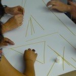
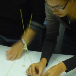
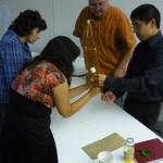
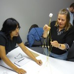
In our September event, we had a ton of fun taking…the MARSHMALLOW CHALLENGE!
We split up into groups and each team was given dry spaghetti, tape, string and a marshmallow. After hearing the rules, each group took on the challenge to build the tallest structure with the materials at hand. Then, once the time was up, the structure had to be sturdy enough to be able to hold a marshmallow on top!
Our groups were able to build some great free-standing structures, but unfortunately a few couldn’t withstand the weight of the marshmallow by the time of the judging!
Then, we watched a great TED talk video at www.marshmallowchallenge.com and got an overview of the purpose of this design challenge and laughed along once we realized that kids are better at this challenge than adults!
After the activity and the video, we discussed what we learned. We realized that kids were probably better at this challenge, as they are NOT as afraid to test something, fail, and try again. They continually prototype until they find an effective design. Kids also would not make as many assumptions about their resources as adults, so they would inspect the spaghetti and feel the weight of the marshmallow. We didn’t think of that and were so surprised when our structures toppled once we added the marshmallow!
Overall, this was a great activity that we all thought would be valuable to do with project teams to help them understand the value of continual prototyping and usability testing. When we are launching websites, all need to remember…the user is not just a marshmallow we can plop on at the end! 😉
Posted: June 23rd, 2010 | Author: Julie Rutherford | Filed under: Events | Tags: think aloud, usability, user research | No Comments »
Hi everyone!
The User Experience Group planning committee has a great night scheduled! We have some video examples of think aloud studies that we will be showing and we’ll discuss best practices that we’ve used when asking participants to think aloud in usability tests. Amy Gill, who is pursuing a Masters degree in Applied Computer Science at the University of Guelph, will also be sharing more information about her research about think aloud practices in usability testing. Some of us from our UX group volunteered as participants in Amy’s studies, so we know we’re in for a treat!
Please click here to register for this event and hope to see you there!
Thursday, June 24, 2010
5:30 to 7:00 pm
Accelerator Centre
Meeting Room #2
295 Hagey Blvd., Waterloo
[Map]
Posted: May 28th, 2010 | Author: Julie Rutherford | Filed under: Events | Tags: NUI, pub, surface | No Comments »
On May 17th, we had a great turnout to our NUIs in your living room, in a pub event!
To spice things up, we asked those who attended the event to submit their recap of the event! Not only does this summarize the event for those who didn’t attend, but those who did attend can hear what the other end of the table was talking about!
Quote 1: In our conversations we talked about the user experience of a video store, a grocery store and independently owned/operated establishments and what they offer over big chain stores. We proposed that there is a certain niche for independent stores like this, and while some people may switch to this niche market if they knew of it, others just demand the convenience of the big chains.
Quote 2: Alas, we did not have an iPad to play with, but many of us have been able to play with one or know someone who has one. We heard about some of the technical specs and who was excited to get an iPad or Kindle and those who were happy with just their smartphones and laptops. It’s clear that NUIs (natural user interfaces) are becoming all the rage as these products become more mainstream, so we as usability professionals will definitely need to become more aware of ways that we can ensure the products we work on are suited for NUIs. Here’s an article that outlines some of the challenges NUIs cause for development and prototyping.
Quote 3: It was a low-key discussion about user experience in a very broad sense. Our talk touched on traditional software-based UX topics, but concentrated on the user experience in retail environments, with a focus on the differences between a globalized and a localized retail experience. Essentially, the ideas that we explored had to do with the different feelings associated with shopping at a local small business with a unique perspective and tightly focused set of offerings, versus shopping at a larger global chain with a wide variety of products, often at a lower price point. Overall, it was a great time, and I can’t wait for the next one!
Quote 4: The most striking conversational detour from me was around relationships that the best stores have with their customers. We talked about it in the content of independent video stores, music stores (of which there are fewer and fewer), and even grocery stores. I pointed out that I’ll often go to my favourite video store (Waterloo’s Generation X, as it turns out) and ask “What should I watch?” or “What should my wife and I watch?”, and have never been disappointed with the recommended film that I then rent. The personal, local relationship has become more meaningful in an age of online access to just about anything.
For anyone who had additional thoughts on our last event or has ideas about future events, feel free to add a comment!
Hope to see you at the Current Think Aloud Practices event on Thursday, June 24, 2010, where Amy Gill will be sharing information about her research and we’ll discuss think out loud sessions!

May 17, 2010 UX Group Event- NUIs in your living room, in a pub
Posted: May 16th, 2010 | Author: Julie Rutherford | Filed under: Events | Tags: design, user research, wireframes | No Comments »
Hey UXers!
Hope you can attend our next UX group meeting tomorrow (May 17th) from 5:30-7pm at Barley Works at the Heuther Hotel.
To read more about what we’ll be discussing and to register, check out our blog post about the event: NUIs in your living room, in a pub.
If you missed our last UX group meeting on April 19th, here’s a quick recap. We had 20 UXers attend our “show & tell” session, which turned out to be very interactive and fun! We split into groups and each group listened to design challenges and ideas that their peers have been working with.
Then, each group picked a representative that presented their design challenge to the whole room. Some of the interesting ideas we heard about include:
- Design challenges for group collaboration and some of the time wasters that get in the way when individuals are working together in an office or on a tabletop surface.
- How Adobe Fireworks can be used for wireframing and for finished designs. We saw how this can be a great tool for creating a design and gathering commentary.
- Overview of recommendations for revamping a website that is used by students and staff at Wilfrid Laurier University.
- Saw examples of how menu options for an application were brought from early prototypes to the final product.
- Got a sneak peak of a new feature for math software and heard about the design challenges of designing for a small space in an existing application.
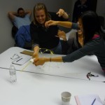
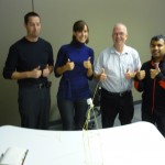
Thanks to everyone who shared their ideas and opinions at this event! Photos from the event are posted below. Hope to see you at our event tomorrow!


Posted: March 23rd, 2010 | Author: Julie Rutherford | Filed under: Events | Tags: event, games, ixda, microsoft surface, surface, tabletop | No Comments »
In last Thursday’s March UX Group meeting, Dr. Stacey Scott spoke to us about the exciting projects that she and her team are working on with tabletop interfaces. She brought us through the history of tabletop interfaces and showed us that there has been a large amount of work that brought us from the earliest prototypes, to what we’ve seen with more mainstream products like Microsoft Surface and the SMART Table.
Imagine playing Risk, but on a tabletop interface!
ARVE Error: need id and provider
This video shows some the amazing projects that Dr. Scott and her team in the Collaborative Systems Laboratory at the University of Waterloo have been working on. They are focussing on applications for tabletop interfaces in two main areas: 1) military command and control operations and 2) digital board gaming. One day, the army or navy might be using these systems and we might be able to enjoy digitalized versions of strategy board games (like Risk and Pax Romana) on our own kitchen tables!
Want to build your own tabletop interface?
Well, if you can’t wait and want to try building your own interactive tabletop, you’re in luck! Contact Professor Michael Haller’s Media Interaction Lab in Austria, from which you can order the same kit that Dr. Scott’s team uses for their work. Order the special grid paper and pens, install a projector, set it all up on any table that you have lying around and voila… you’ll be able to tinker with your own tabletop interface! If you have any luck, you can enter in the SMART Multitouch Application Contest and compete against other developers who are working on surface applications.
Join the new IxDA Waterloo site!
In other news, we have a new IxDA Waterloo site! Check out the link to see more information, learn about other IxDA events, and gain access to more resources about design and user experience. While there, we encourage you to join IxDA (it’s free) and indicate your membership with IxDA Waterloo. We’re currently looking into ways to combine our current UX group blog with this new IxDA site.
Send us your ideas for future events
The UX group planning commitete brainstormed after last Thursday’s event and we came up with some great ideas for future events. We plan to continue the tradition of “UX drinks” after our monthly events, so we can get together to chat in a more social atmosphere. If you have any thoughts or ideas, please leave a comment. We’d love to hear from you!